1. Relative Contrast
2. Too Many CTAs
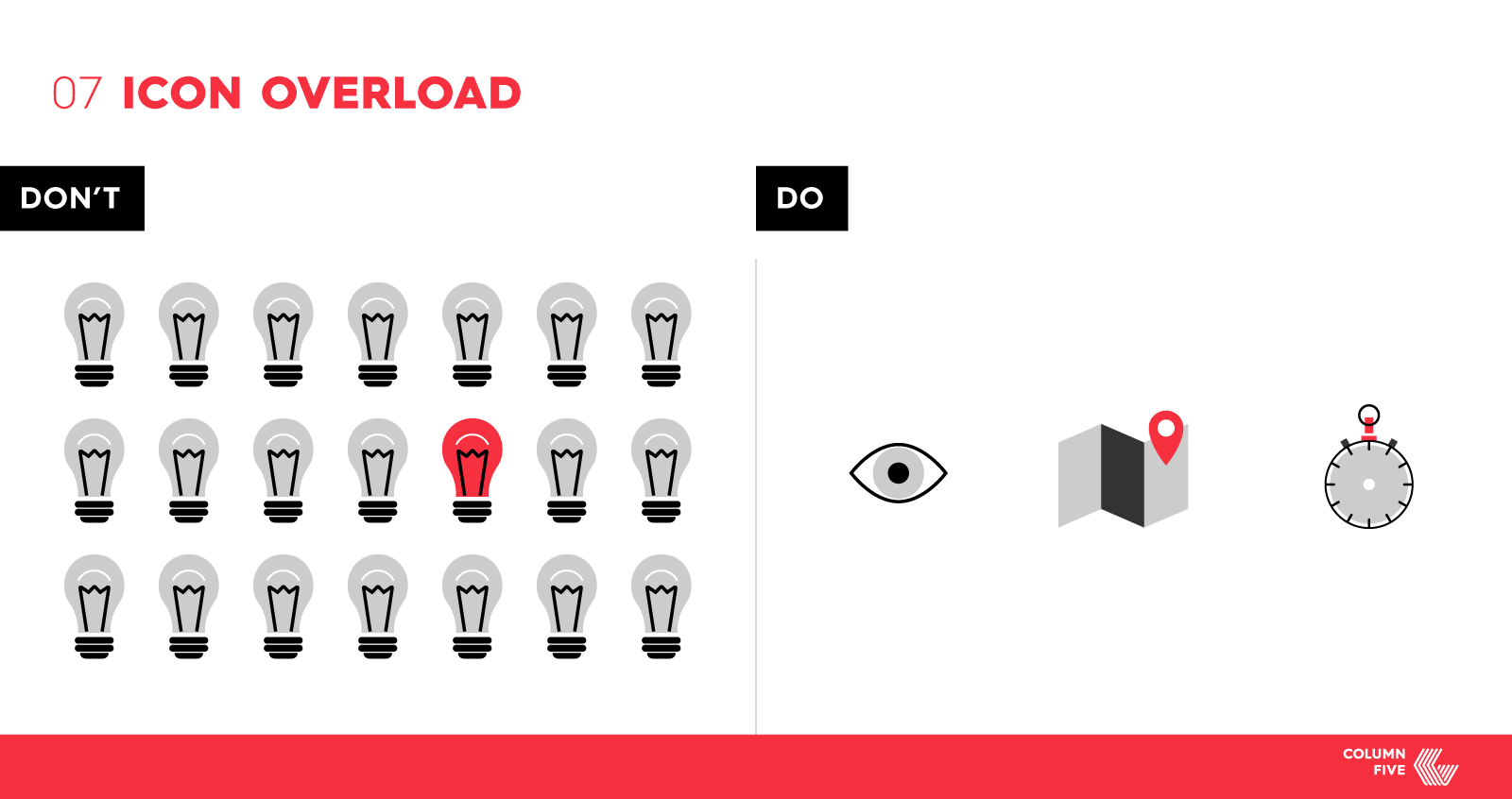
3. Visual Overload
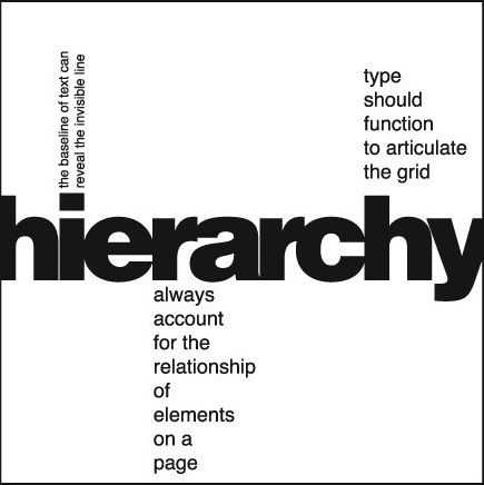
4. Jumbled Font Hierarchy

5. Over-Stylizing Elements
6. Consistency and Deviation From Branding and Style
6 Common Design Mistakes to Avoid as Marketers
Marketers are frequently finding novel solutions for ways to advertise events, products, and services. Most of the solutions involve design – banner ads, white papers, posters, infographics, email banners, web pages, among others.
Most of the time these solutions are exactly what a marketing campaign needs, but sometimes design is placed on the back burner when these novel solutions are used.
The campaign might have all the right design elements, necessary information, and audience, but with an even better understanding of both design and user interaction / psychology – you can elevate the design into a marketing campaign enhancer.
Among various reasons a marketing campaign might fizzle out (poor messaging, poor seller-centric approach, etc.) design is one variable that can strengthen or weaken all aspects of the campaign.
Your message and audience might be perfect, but all that time and energy put into the campaign may be wasted because of something as simple as a color that’s too bright or a font that’s too large. Users have the attention span of a donut, and they can dismiss an ad simply because you wrote “revolutionary” as “REVOLUTIONARY” in bright green type.
Here are six general design mistakes that should be avoided in a marketing campaign.
1. Relative Contrast
When designing materials you almost always start with layout, then move on to visual style, and then the smaller details such as fonts, imagery, colors, etc.
It’s easy to get lost in choosing great fonts, colors, and arrangements of elements and then forget to look back at the overall design as a whole and adjust all the elements in their relative visual space to each other.
Sure, you might have all the essentials of the campaign implemented, but now it’s a matter of creating a visual narrative for viewers to follow, a hierarchy.
It’s tough to tone some aspects of the design down when it is feared that each element is as important as the next. The magic of designing things with different contrast is that one visually prominent element can lead the user’s eyes to the second most prominent element, which in turn leads their eyes to the third element, and so on all the way to your CTA.
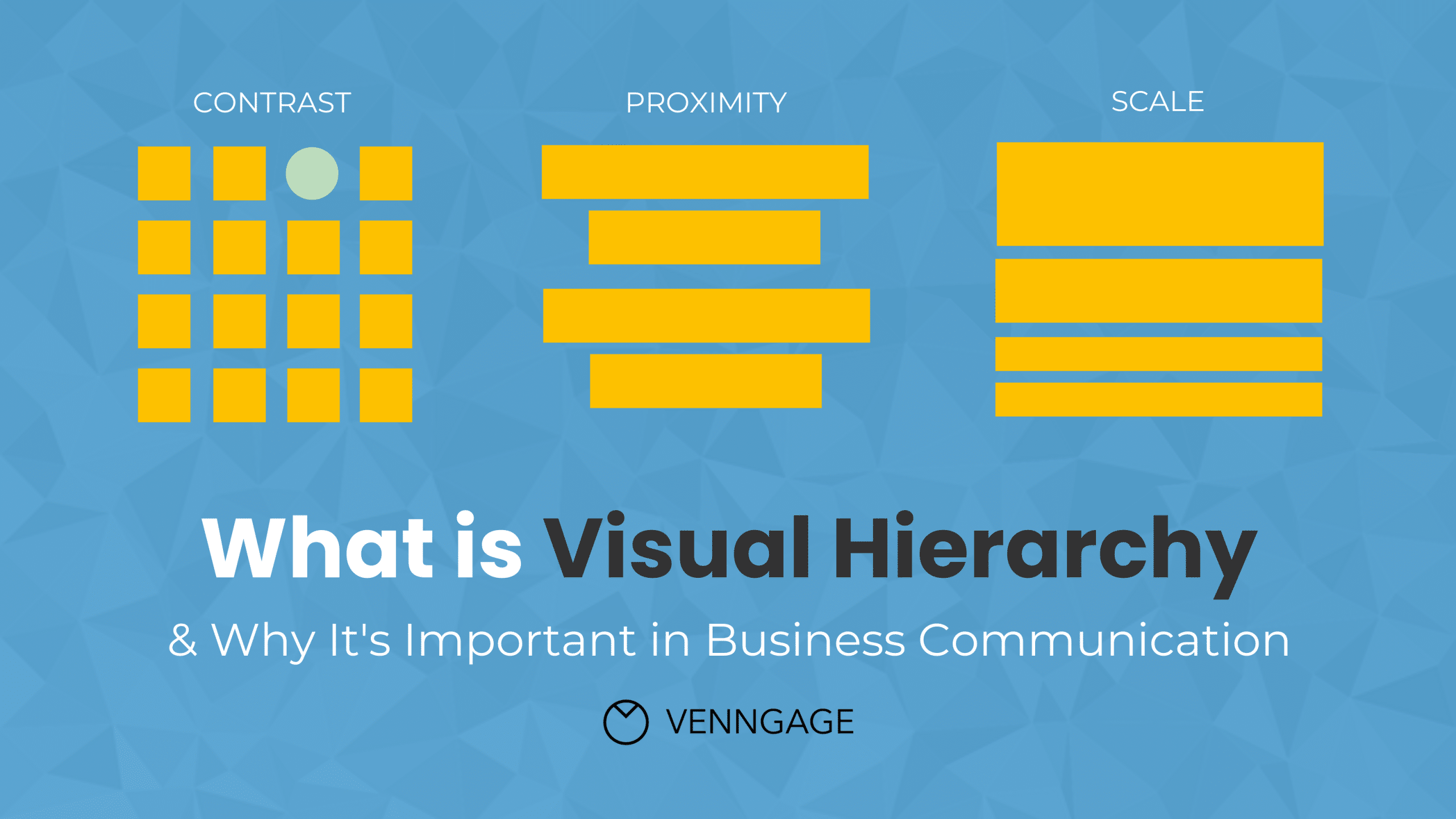
Show your audience the path and walk them down it.
2. Too Many CTAs
Speaking of CTAs. “Click here to Sign Up!”, “Check out our latest tool!”, “Subscribe now!”, “Read our white paper!”, “Get more info about this event!”. What, oh, what should a user click on first?
Except, that’s exactly the kind of question you shouldn’t be asking. The question that needs to be asked is “What is the easiest path we can create for our audience to access what they need?”.This is not to say that users shouldn’t be given a choice between two CTAs, but instead of turning your layout into a Choose Your Own Adventure book.
When it comes to CTAs, you want to have balance. Not too many, not too little, not too wordy, not too short, not too demanding, not too passive. Convey your message effectively in a way that makes sense to you and your viewers and don’t overthink it!
Again, show your audience the path and walk them down it.
3. Visual Overload
In the same realm of having too many actionable paths available, the user should also not be bombarded by too many visual elements at once. Even with the perfect contrast and perfect actionable path, a user might still walk away from a campaign simply because there were too many images behind copy or too much text crammed into a small 300×250 ad.
Similar to how it’s hard to make one element less of a visual priority when it’s still a high visual priority, it’s tough to remove images / graphics and subdue them. Most of the time, one great image that represents your campaign’s message is better than two perfect images for your campaign. Each time you fill up the user’s visual field you are decreasing the effectiveness of the overall layout. Two perfect images are now two perfect images inside a “meh” campaign.
Sometimes, less is more, think quality over quantity.
4. Jumbled Font Hierarchy
Imagine you are trying to communicate to the user three specific pieces of information. There is a headline that draws the user’s attention, there’s a line of copy that gives deeper insight, and then there is a call to action.
Now imagine that the entirety of the design layout uses three different font types, each with three different font sizes, three different colors, and some elements italicized or bolded. Those three distinct elements in the visual hierarchy that gave good logical structure to the user is now divided up into about 20 different font styles, each with a different visual priority relative to the other 20 font styles… sounds like a nightmare to read.
It’s hard to determine visual priority in the limited amount of time a user is interacting with a campaign and the simpler font equals less mental hurdles for the user to get over.
Tip: It’s always more effective to match font choices to the copy’s intent and to limit extra styles, rather than putting emphasis on words in sentences.
Of course, don’t make the opposite mistake with font styles and limit yourself to one font type, color, and style. There will always be at least two levels of font priority if you intend to include a CTA.
5. Over-Stylizing Elements
Even the simplest design can still be difficult to process for a user merely because of over-stylized elements. You might have a design that is just one line of text and a call to action, but it’s easy to misinterpret this simplicity as a need for “more design”.
It’s this thought process that converts into the background. Having a gradient, the CTA button getting a border, the font appearing with a drop-shadow, and a random image thrown in between the two for fun – all unnecessary changes that cause a missed opportunity to create an elegant design through minimalism.
As mentioned before, sometimes when it comes to design, less is more. The design of your content should enhance and highlight the message you are trying to get across, not distract from it.
6. Consistency and Deviation From Branding and Style
At the end of the day, with all design elements considered in each individually designed campaign, there still needs to be a thread of consistency across all of the designs as they relate to the company’s brand conventions and standards. This helps to maintain an understanding of your messaging and identity across the experience of the product.
In specific instances, however, it is necessary to break design rules and branding in order to accommodate the specific marketing campaign, which should be encouraged when it enhances that specific campaign.
As an advantage, deviation from the branding helps to avoid stagnation where users have the opportunity to have fresh eyes on your product / services. The trick is to break the rules in a way that it still maintains at least some familiarity with the brand identity in order to avoid complete alienation of the brand from your audience.
If you are ready to get your own awesome content on your site, check out our Content Builder Service. Set up a quick consultation, and I’ll send you a free PDF version of my books. Get started today–and generate more traffic and leads for your business.


Get a Free Consultation
for Content Marketing