5 Surefire Tactics for Website Conversion Rate Optimization
Outstanding organic traffic doesn’t mean much if those web visitors aren’t converting into paying customers.
Creating great content is a necessity for sure, but it’s important to remember that the real end goal is for readers to act. Conversion rate optimization (CRO) tactics are specifically designed to increase the percentage of visitors who take action after engaging with your content.
Get this: even though 82% of marketers are currently using content to drive web traffic, a whole 63% lack a structured approach to optimization.
The missing link? It’s CRO.
But great CRO is more than just those standard best practices that every marketer knows. Calls to action, important information above the fold, making a clear offer on your landing page — these are all good tactics, but every decently marketed company is using them. Not to mention most consumers know the game marketers are trying to play.
To get the results you want, you need a CRO strategy that is genuine to consumers and stands out from your competitors.
Read on for 5 unique, effective conversion rate optimization tactics you should start using right away.
Quick Takeaways
- Message matching creates a consistent content experience and delivers on the promises you make on SERP headlines.
- Micro-commitments allow customers to engage incrementally with your brand until they’re ready to fully commit.
- Utilizing pop-ups for conversion rate optimization is all about getting the timing and the offer right.
- Lead magnets drive conversions by providing high-value content in exchange for contact information.
- Creating FOMO with your CTAs, pop-ups, and lead magnets can make potential customers think twice before leaving your website without taking action.
5 underutilized tactics for website conversion rate optimization
Message Matching
Online content is crucial to any marketing strategy. However, it lacks some of the most vital parts of an in-person sales pitch, such as the physical gestures involved in a natural exchange, or the expressions a person’s voice and face emit during a conversation.
These aren’t easily captured in the written word. That’s why message matching is crucial to website conversion rate optimization. Message matching is the art of aligning your web page’s message (which includes your page’s design, copy, and general message) with the rest of your content channels.
Why? Because those components are what makes up the digital version of your brand personality.
Every part of what consumers read and see on your website creates an impression that they take with them and use to make decisions. It’s also the place they expect to see delivery on the promises you made in Facebook and Google ads, blogs, and meta descriptions.
For example, 93% of all web traffic begins with a search engine. After someone performs a search, sees a headline, and clicks the link, they expect to see an expansion of what that SERP headline advertised. You need to be sure your website’s messaging matches up.
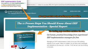
Take the example below. You can see the ad copy matches the landing page headline, and the headline matches the CTA copy further down the page. The customer receives consistent messaging and the website delivers a lead magnet that fulfills its promise from the Google SERP.
True message matching creates more than a brand interaction — it creates an experience. When you practice effective message matching, you build brand trust, which is one of the top traits consumers seek when making a purchase decision.
Micro-commitments
Micro-commitments is the process of gaining commitment from people incrementally, rather than expecting them to go right from web visitor to paying customer in a single jump.
Research shows that on average, it takes 6-8 touches before a lead turns into a conversion. Micro-commitments are a way to encourage more interaction without pushing a purchase right away. This takes the pressure off potential customers and allows them to feel in control of their buyer journey. Micro-commitments are also another way to build that all-important brand trust.
Some examples of effective micro-commitment asks include:
- sharing a post on social media
- following your your social media accounts
- subscribing to your email newsletter
- signing up for a free trial offer
- participating in a survey or questionnaire
- downloading free content (like an ebook)
The best part of micro-commitments? They keep customers connected to your brand well after their first purchase. That initial conversion may take more time, but micro-commitments build lasting, trusting brand-consumer relationships.
Exit pop-ups
Pop-ups are a frequently used tool intended to help grab a reader’s attention and direct them to a specific offer, but they’re rarely used effectively.
So how do you do a website pop-up right? You have to nail two things: the timing and the offer.
Let’s start with timing. We know already that consumers don’t want to be bulldozed by an ad the second they arrive on your website. So first thing’s first: no pop-ups before readers even get to your content.
But brands do this all the time! Right? Yep, they do. And most people click the X before they even read what the pop-up has to offer.
Exit pop-ups, or pop-ups designed to appear when a customer finishes reading your content or goes to leave your website, are a much less annoying and more effective way to use pop-ups for conversion rate optimization. It allows web visitors to get to know your brand before asking them to commit further.
The second thing you need to get right is the offer. Pop-ups that ask consumers for something without making a clear, high-value offer in return are unlikely to yield many conversions. Think not only about your CTA but also about your offer message.
This doesn’t have to be complicated. For example, let’s imagine you’re going to add an exit pop-up every time a customer scrolls to the bottom of a blog post (presumably having read that article). Rather than simply asking them to subscribe to your blog, remind them about the value your content can provide.
Here’s a good example:
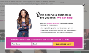
Not only does this pop-up tell the potential customer exactly what they’ll receive, it tells them how it will make their lives better. A simple reminder to your customer about what your content will do for them (rather than focusing on what you want them to do for you) can make your pop-up more effective.
Lead magnets
Lead magnets are high-value assets offered in exchange for a person’s contact information. They offer something more than what users can get from your regular free content. They help users solve a specific problem, develop a skill, or accomplish something else directly applicable to their job.
Lead magnets are an effective conversion rate optimization tool because they offer something of real value to your potential customers and they do it for free. Who can resist free stuff?!
Well, actually . . . a lot of people. The internet has made free stuff commonplace, so for yours to perform it needs to be awesome. Here are some examples of lead magnets that work:
- Ebooks and whitepapers – Ebooks and whitepapers are both great ways to expand on a topic you cover in your free content (like your blog) and show your brand expertise. The main difference between the two is the expertise level of your audience. Ebooks are generally geared toward non-experts and include introductory content, while whitepapers are more in-depth.
- PDF checklists – People love PDF checklists because they help to make complex problems simpler. They can help your customer feel more motivated, organized, and productive.
- Templates and guides – Templates and guides help people get started on a project that may feel overwhelming by providing a ready-made framework.
- Video content – Videos are the type of content most preferred by consumers. Some popular kinds of video content include how-to tutorials, product demos, and topical webinars.
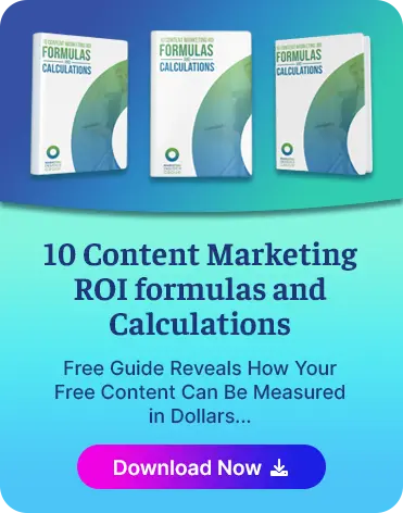
Here’s a deeper dive into creating lead magnets that actually convert:
Remember: your customers don’t owe you any favors. Sharing contact information is a big deal these days (no one wants to get spammed by every single brand they interact with). Great lead magnets send the message that you value your potential customers and their information by offering something in return that’s truly beneficial and applicable for them.
Create FOMO
We all experience it, right? Fear of missing out is part of the human experience, and brands can leverage it in their conversion rate optimization strategies.
Remember earlier when we said your pop-ups and lead magnets need to demonstrate your brand’s value? Well, another way you can drive home how valuable your products and services are is by using a little reverse psychology to create FOMO.
Any pop-up or lead magnet typically has two choices: yes (I’ll subscribe, opt-in, share my info — whatever your CTA is) or no thanks (aka not interested). But what if you spice up that no thanks by focusing on what users will be missing?
It’s like this:
If you’re using an exit pop-up that asks users to subscribe to your content in exchange for a discount, you might say something like: “Subscribe to our newsletter for weekly content and 20% off your first purchase!”
Now it’s time to create some FOMO. Instead of giving a simple “No thanks” option, try: “No thanks, I’ll pay full price.”
Say what?!
Now you’ve got their attention. No one prefers full price over a discount. Now, at the very least, your user is going to double take and reconsider subscribing to your content.
An important PSA here: take care not to use language that comes off as arrogant when you’re trying to create FOMO.
“No thanks, I’ll pay full price,” might earn a double take. But “No thanks, I like paying more money,” will likely earn an eye roll or worse, turn a user off. That’s because rather than aiming specifically to remind a user about what they’ll miss, that second option insinuates that they’re unreasonable if they say “no, thanks.” That’s a big miss for a brand.
So, in short: FOMO, yes. Insults, no.
Drive conversions with great content
No matter what tactics you decide to use to increase conversions, great content should be the foundation for your strategy. Content marketing is one of the most valuable and quickly growing forms of inbound lead generation .If publishing consistent, quality content isn’t on your priority list, now is the time to add it.
Marketing Insider Group and our team of writers can deliver you SEO-optimized, publish-ready content every week for one year. Check out our Content Builder Service or schedule a quick consultation with me to learn more.


Get a Free Consultation
for Content Marketing