
How to Engage and Convert Site Visitors
When you land on a website, what makes you stay? What makes you bounce? And what makes you decide to push a CTA button? These are the questions you need to ask yourself as you evaluate your own website. You have to put yourself in the shoes of your visitor and see your site and everything on it through the eyes of that visitor. You don’t build a website for yourself – you build it for others – others that you want to stay a while, navigate around and ultimately make some kind of conversion. Even though you may be able to vaguely describe what it is that keeps you on other sites, here are nine concrete tips for your own that you will want to consider.
1. Purpose and Value Proposition
Within seconds, you need to engage a visitor who lands on your page. Most important, that visitor must understand the purpose of your business and must see some value in staying a while and discovering the details. There are several ways to do this, but loading that page up with a lot of text to provide these explanations is certainly not one of them. Consider the following:
- An “explainer video.” This is a 30-90 second, professionally designed video that will give the visitor both your purpose and the value your business brings to them. If you want to see a great example of this, check out Dollar Shave Club’s home page.
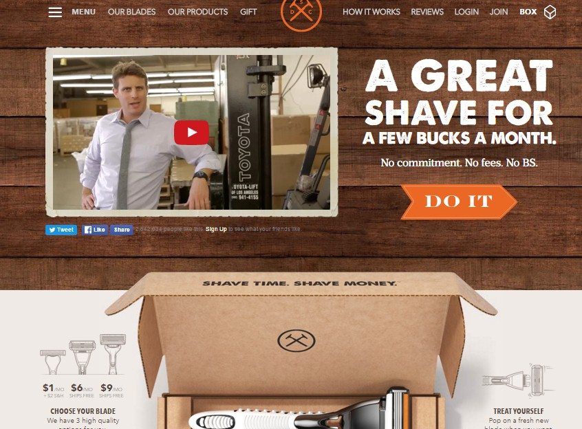
And while the video is engaging, funny, it explains the purpose and the value. You also get the value in bold type. This landing page makes you want to get the details, some of which are given below the fold but explained in greater detail by clicking the links at the top.
This explainer video is so popular, it has received 22 million views.
- For small businesses without the money to produce this kind of video, there are combinations of images and text that can get the point across immediately. While basecamp is no longer a small business, its home page is one that could easily be designed by anyone on a small budget.
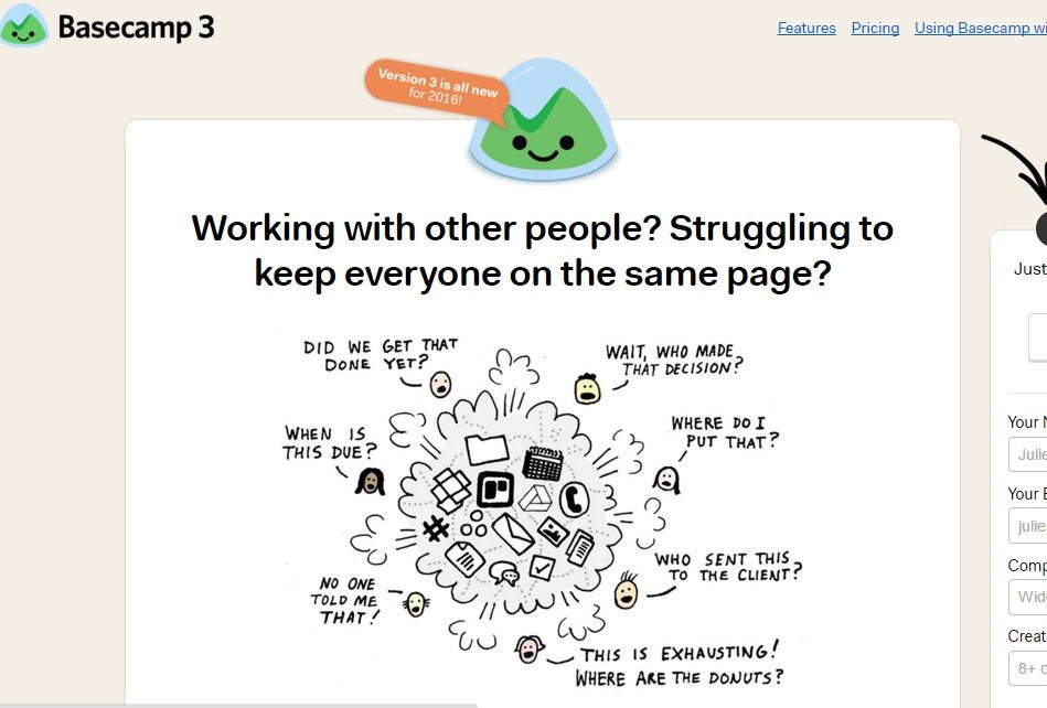
This is a humorous way of addressing a problem that most organizations face – projects involving multiple people and need some way to keep them all “on the same page” – to manage them. The image engages the viewer immediately; the text below gives a brief explanation of what Basecamp software does for project organization and ends with the number of companies currently using its software, naming some of them for good measure.
Both of these companies have it nailed. The have told you who they are and why you should buy their product. And this is the biggest mistake that most websites designs make. They want to feature products and describe them instead of focusing on the value to consumers.
What Makes a Good Value Proposition?
Take a look at your landing page and see if it does or has the following:
- A bold large headline that grabs attention immediately
- Perhaps some sub-headlines with a few bullet points that give a bit more detail of what you offer.
- Simple vocabulary – you don’t need industry jargon. Find simple words and be casual about it (unless you are Rolex or Mercedes Benz). If you know your customer, then you know the language you should be using.
- Visuals/Images that grab attention – no stock photos, please
- Typography that is easy to read – you don’t have to settle for standard fonts – there are some new ones that are both unique and easily readable
- Clearly shows the value the potential customer will get by doing business with you. Customers want their problems solved, whether they need to buy a new pair of pajamas or find the ideal HR software package.
Past The Landing Page – the Detail and the Conversions
Once you have engaged your visitor with your purpose and value, there are a number of other things that you should be doing to engage and convert.
2. Boosters
These are things that will boost your credibility and/or the motivation of a visitor to make a conversion. They may include the following:
- Reviews and Testimonials: These can be quoted directly on your site. Other markers of credibility for a B2B business are a listing of companies that you have purchased from you.
- Money-Back guarantees: This improves trust; listing a time-frame is also good “If you don’t love it after 30 days, we’ll give you a full refund.”
- Give Bonuses: Offer a free item or a month of free technical support with a purchase; offer free shipping for a limited time or over a certain purchase amount; offer free updates if you sell software.
- Gate an offer for an email address.
Get a little creative and see what “boosters” you can offer that will entice a purchase.
3. Free Trials
This can be used when you are selling software, a subscription to an online magazine. Foundr Magazine does this every once in a while. Basecamp does this consistently with its project management software; financial accounting software companies also do this. Facing some stiff competition from some newer “kids on the block,” Basecamp recently published this letter from its founder plus an offer to try its software for an unlimited time:
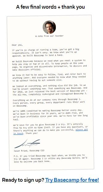
The letter is a nice touch – it personalizes the benefit message, explains that the company has been around for 16 years and that it now has a new version – an attempt to get former clients to return.
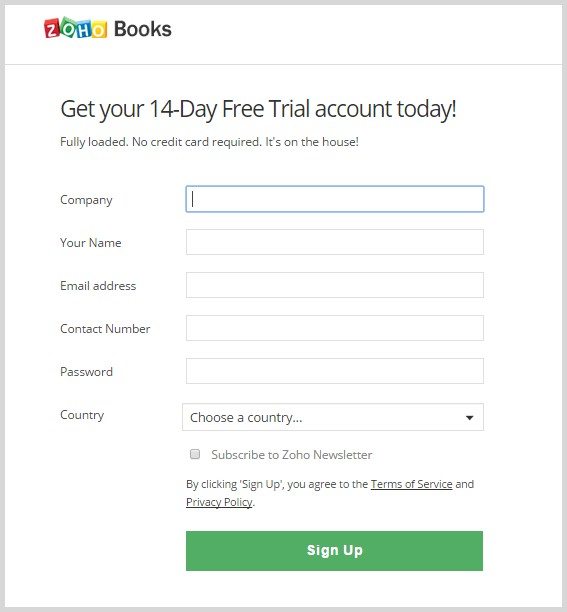
Zoho Books, a company offering small business accounting software, has a 14-day free trial. Its great feature is that it requires no credit card to take advantage of the trial. Because Zoho has only been in business for about 5 years, it is a “newer kid on the block” and must come up with a boost that is too tempting to resist.
4. Persuasive Content
You will have content on your site other than you landing page and your offers. You may have detailed product descriptions; you may have a pricing page; you should have a blog. All of these require content that is engaging. Here are some things to think about:
- Be certain that your blog posts are SEO optimized so that you can be found through organic searches
- Be sure that any content you have is updated – old stats and dates indicate you are not “current.”
- Break up all text with great, catchy headlines and bulleted points for easy snacking
- Use images and visuals as much as possible – not just photos, but infographics and videos too
- Be certain that your blog has plugins installed for conversations and for social sharing. People like to look “smart” within their communities. If you have a post with great information or that solves a problem, they will want to share it with their communities.
5. Chat Feature or Phone Number
People like to have their questions answered immediately. If you can install a chat feature or have a phone number that goes beyond normal business hours, that is a great feature. Advertise hours for both.
Recent survey results showed that 63% of online customers state they will return to a site that has a live chat feature.
6. Prominent and Engaging CTAs
Here are a few tips for CTA buttons that grab attention.
- Tell your visitor why s/he should click right on the button if possible. “Show me the jeans I will love,” “Get my coupon now,” “Start your free trial – It’s on Us.”
- Watch the size of your buttons, particularly for mobile devices – plan for a fat thumb.
- Use a compelling color – blue and green seem to work well, but orange and red are good for certain sites, like Red Bull or children’s toys.
7. Don’t Autoplay Videos
It’s un-nerving to have a video start automatically. Give your visitor the choice of if or when to begin the video.
8. Limited Pop-Ups
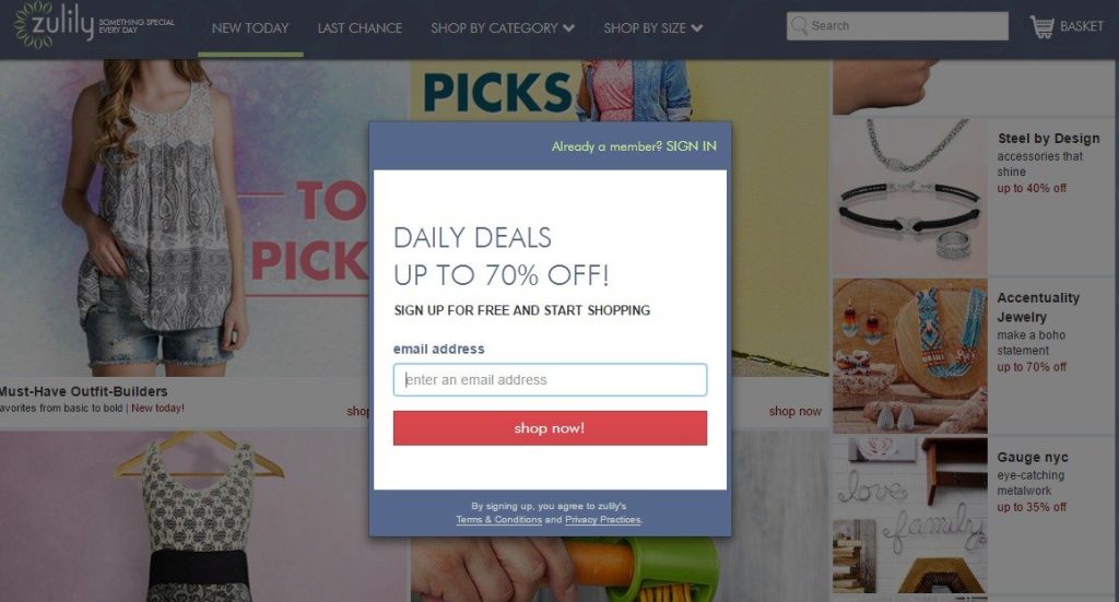
These can be very effective as long as they are in moderation and offer something of real value. It is an aggressive form of engaging visitors can be irritating. And don’t gate regular content with a pop-up that requires a conversion. Here’s an example of a bad idea for a pop-up.
Zulilly is a popular site for kids and women’s clothing and accessories. However, when a visitor lands on the site, this pop-up immediately appears. A visitor cannot get into the site without providing an email address first. Many will bounce because of this. And what is with the “sign up for free” statement. Since when did any online retailer charge for signing up to shop? There is no value to this pop-up except for the company.
9. Easy Navigation: Goes without Saying
A site that does not allow quick and easy navigation is a loser. Keep the navigation bar very simple and make the link titles very clear.
- Have as few as possible
- Drop-downs are fine but not for mobile
- Put links on every page, so the user does not have to return to your home page to go to another link – it’s irritating
Your website is your company – it is your personality, your purpose, and your value to potential customers. They are not walking into your store/building to be greeted and served personally. Your goal is to simulate that environment as much as possible. You are not just a “what;” you are a “who.” You are someone with a clear purpose and a clear value to offer. Be sure that your site projects that with everything a visitor reads, sees and hears.
In Summary
Your website is the backbone to your online presence, but your website visitors are the ones who ensures the need for your website. Focus on how you can continuously improve user interaction on your site by testing new opportunities and learning from the data collected through the tools you’ve deployed on your site. Doing this will set your website up to achieve its objectives and serve a purpose to your company’s growth.
One thought on “How to Engage and Convert Site Visitors”


Get a Free Consultation
for Content Marketing

Yeah you are ryt.. Its a great list. Never forget to engage with them. Talk to them on live chats with help of website chat software like revechat or any other. Ask for feedback. If they are on your website, help them, tell about good points of your services .