
Google Ranking Factors You Need to Know for 2023
2023? Say what? You read it right! It’s hard to believe we’re already ready to wind down another year. As we say goodbye to 2022 and prepare for the final few weeks of 2022, it’s not too early to think about what new strategies you want to add to your content marketing plan for next year. One of the most important factors to consider? Google ranking factors.
Just as trends in web design change and evolve over time, so do SEO best practices. Google is constantly evaluating which factors indicate a high-quality website for their users. It’s important to keep up with these ranking factors if you want to stay on top of the search engine rankings pages (SERPs).
Nobody (apart from maybe Google themselves) has a crystal ball that can say for sure what these ranking factors for 2023 will be. But we can still evaluate available data, look at current trends, and use official advice published by Google as a guide.
An important thing to know: Google uses around 200 ranking signals to determine where it will rank sites. But publishing content that’s optimized for all 200 of these signals? Impossible. Fortunately not all of these signals are equally important, and you can optimize your content around the factors that hold the most influence.
Let’s dive into the 10 factors that most SEO experts agree are the most important ranking signals for content marketers to focus on.
Quick Takeaways:
- Google prioritizes high-quality, high-value, relevant content.
- Keyword best practices have changed, but they remain an important SEO factor.
- Providing a good user experience is paramount to organic search rankings.
- Focus on mobile optimization is increasing in importance as more people use mobile and voice search.
- High-quality backlinks continue to be central to Google’s ranking algorithm.
PS – I put together these 10 tips for optimizing your content marketing. Watch Now!
High-Value, Relevant Content
2022 saw the launch of Google’s widely-anticipated Helpful Content update. Which turned out to be exactly what it sounds like. Thin, promotional, keyword-stuffed content lost rankings in this update. And not surprisingly, longer-form, educational, thought leadership content climbed in rankings.
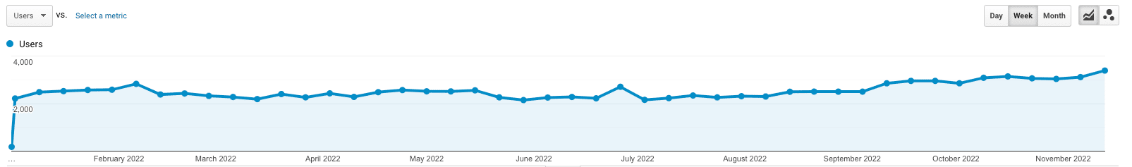
Across more than 30 clients, we saw gains in 90% of our monthly reporting following the August 25th rollout. Our own website saw a roughly 20% gain in search traffic in the weeks following the update from an average of 2,500 google search visitors per week to an average of 3,000. And that number is still rising. Why? Because all we do is helpful content!
And the Helpful Content update just continued the recent trend from Google in focusing less on technical factors and more on user experience.
Last year, they confirmed that the AI-powered algorithm RankBrain is the third-most important factor in deciding where a particular web page ends up in the search results. RankBrain analyzes user activity with search listings in an attempt to quantify their relevance and quality. For example, if a user clicks on a page that provides useful information and stays on the page for several minutes, this is likely to result in a higher ranking than a thin page that’s not useful or has a high bounce rate.
Keywords are still important — you need to make sure you’re including relevant keywords in your content in order to appear in the top search results for that particular keyword. However, Google’s algorithms are now a lot more sophisticated at judging whether your content is really covering a topic in a relevant way or just stuffing in a few keywords.
The really valuable thing about RankBrain is that it eliminates keyword-stuffed content from SERP top results. Instead, it ranks the content that provides the most relevant, high-quality, high-value content for that particular query. As a result, there really is no tried and true way to optimize for RankBrian itself. This video explains this in more detail:
As you can see, it’s not about finding one single way to optimize for RankBrain (it doesn’t exist). Instead, it’s about knowing what’s most important to your audience specifically and creating authentic, high-value content that addresses their needs. Keywords and other ranking factors are of course still important, but without quality and relevance, RankBrain won’t push your content to the top of any SERP.
PS – Check out our weekly blog content service to grow your website traffic and leads!
High-Quality Backlinks
Backlinks are arguably the most important factor directly influencing your rankings. They are the foundation of PageRank, which is at the core of Google’s ranking algorithm. While PageRank itself hasn’t been updated in several years, Google has confirmed well after that last update that they still use it.
Backlinks help Google to assess your authority and they also help other web users to find your content. Alongside creating high-quality content, you also need to have a well-thought-out link building strategy in place.
Quality is still the focus over quantity. While it is true that the more links you have, the better, your focus should be on building links from high-quality, high-authority sites.
Keywords
With so much of the conversation focusing on why brands need to stop keyword stuffing (true!) and focus more on quality, it’s easy to get the incorrect message that keywords aren’t important anymore.
This could not be further from the truth. It’s accurate to say that keywords are no longer the be-all and end-all that they once were when it comes to SEO, but they’re still very important. In fact, what’s really changed is not the importance of using keywords, but the strategy for using them.
We know from Google’s messaging around RankBrain and some other factors (that we’ll get to soon) that the AI behind Google’s algorithms is getting smarter, and they expect more from content creators than content packed with keywords but lacking real value.
Today, you can use keyword analysis to develop your content plan and find topics that are relevant for your audience. You can also position keywords in your titles, headings, and text body to help push your rankings higher. But you cannot depend on keywords alone.
In fact, if you feel like you’re forcing a keyword into a particular place in your content, you probably are. Quality comes first with keyword placement in mind. The two must work hand and hand in order to generate better rankings results.
Site Authority
Google employs human agents to assess the quality of SERPs and the pages that make up the first page of results for various searches. It publishes guidelines for these search raters to follow when rating the quality and relevance of these pages.
These guidelines confirm that expertise, authority, and trustworthiness — also known as your EAT rating — are an important factor in ranking pages, specifically those that fall under the “your money or your life” category (generally sites that offer health or legal advice or process financial transactions).
For this reason, it’s important to demonstrate your authority in your niche to Google and to your audience. This may be something you can do right away by publishing author bios with relevant qualifications or experience, or it may be something you build up over time by publishing excellent content and earning a reputation as being an authoritative source.
PS – Check out our latest case study that shows how we helped one company double their leads!
Site Structure and UX
Publishing high-quality web content won’t make an impact if your site is impossible for users and Google site crawlers to navigate. For this reason, you need to make sure that your site is built around a clear hierarchical structure and places focus on the user experience.
A good user experience means that searchers are likely to stick around to explore your site for longer. This is a positive signal for Google that your site is helpful and should be rewarded with a high ranking.
You can ensure an SEO-friendly site structure by going back to basics: keep your URLs short and make sure they include your keywords, implement intuitive and simple navigation, eliminate duplicate content pages on your site, and include a sitemap.
Mobile Optimization
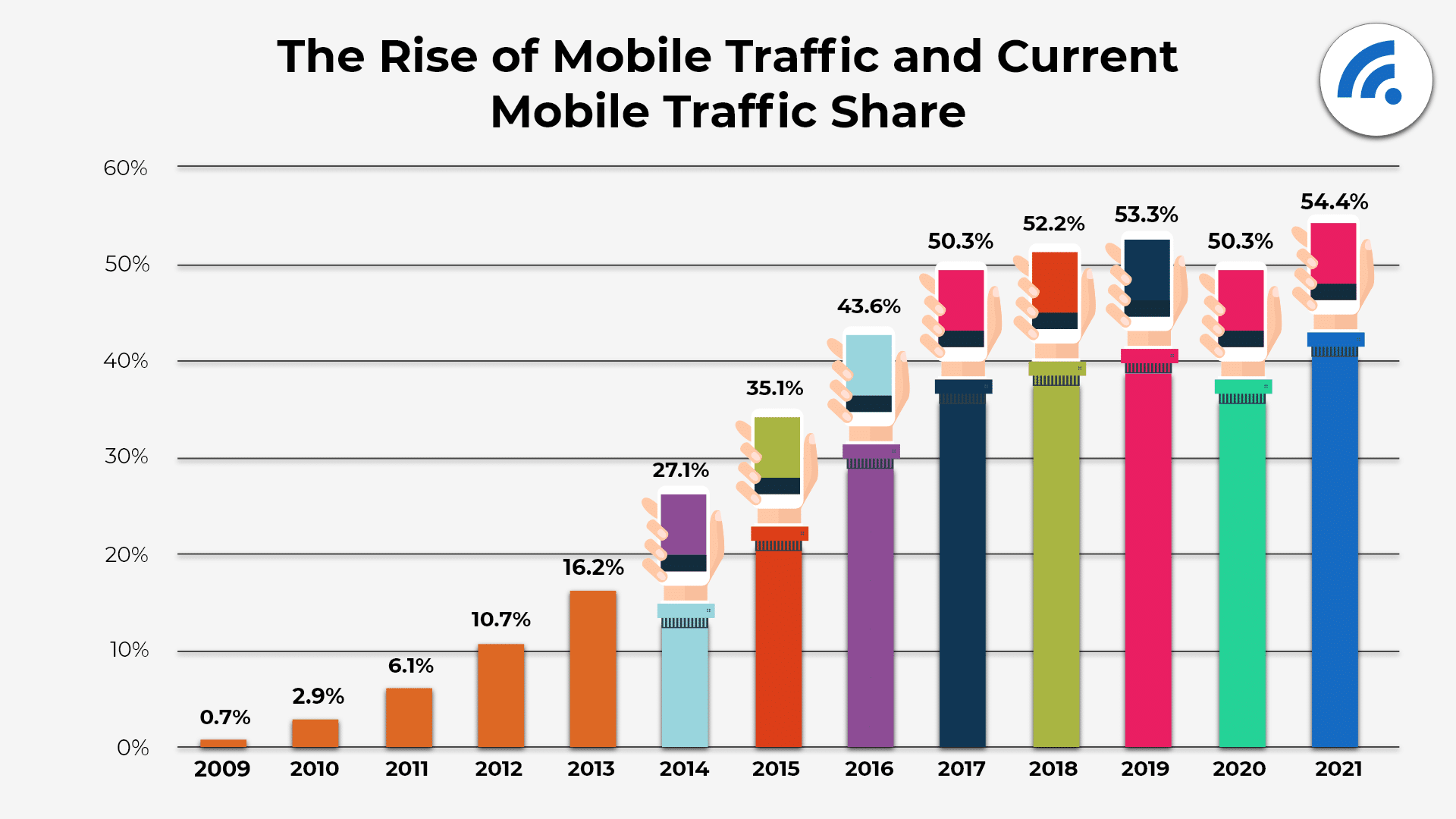
Google has now implemented mobile-first indexing, meaning that the mobile version of many sites is considered to be more important and useful than the desktop version. This makes sense given that more than half of all web traffic is generated via mobile devices and Google’s share of search engine queries is at 96%.
What this means is that it’s time to move beyond the mobile-friendly strategies we’ve learned in the past and focus on all-out mobile optimization and responsive design. In short:
- Mobile-friendly sites work for mobile users but were built for desktop users
- Mobile-optimized sites are designed for mobile searching and reformat accordingly
- Mobile-responsive (or responsive design)adapt to the user’s device, reformatting and restructuring based on device and screen size
Responsive design is still the gold-standard solution. To better understand how your website stacks up to mobile design standards and where it needs improvement, you can use Google’s mobile usability test tool.
Site Speed
Have you ever clicked on a Google result, waited a few seconds for it to load, then gone back to another result that will load immediately? You’re not alone. Today’s web users are impatient!
This can mostly be attributed to the changing ways we’re using search engines. As mobile and voice search rates have soared, people increasingly use search engines to find quick answers to their questions throughout the day, even (and especially) when they’re on the go.
As a result, it’s become vital that you optimize your site to be as fast as possible. Shaving even a few microseconds off your site load time could make a significant difference to your ranking.
If you’re planning a site refresh for 2023, make sure speed is near the top of your list of priorities when it comes to development. Otherwise, there are many other things you can do to speed up your existing website, including compressing images and using a CDN.
You can also use the Google PageSpeed Insights tool to see how fast your site is loading and find tips for how to speed it up.
Domain Security
If you haven’t yet made the move from http to https, now is definitely the time to do so. Your domain security links in with your trustworthiness — one of the main contributors to EAT rating and top factors Google uses to rank your content. Google doesn’t want to send its users to a site that may not protect their data or be otherwise harmful.
Having an SSL certificate is, of course, essential for e-commerce sites, but it’s now no longer an optional extra for more general sites that collect any kind of user data. At least those that want to rank.
And while we’re on the subject, maybe add some extra domain security from your domain provider. DDoS and CDN protection, as well as tools that look for SMTP anomalies are a great idea.
Metadata
We’ve already mentioned RankBrain and how it uses time spent on a page as a measure of its relevance and quality to each searcher. RankBrain also looks at another factor— clickthrough rate.
Clickthrough rate measures the number of searchers that click through to your site after seeing the results of their search. This factor has nothing to do with the quality of your site as they haven’t even seen it yet. But it is dependent on how relevant your content is to their search and how enticing your link is.
What does this mean? Creating killer headlines and meta descriptions is essential. Remember, you can create the best content in the world, but if no one sees it you’ll get nowhere.
Business Listings
Local SEO has grown in importance over the last few years. As mobile searchers continue to dominate, any business that has a physical presence must focus on their local SEO for improved results on a national and global level.
A successful SEO strategy has many facets but one of the most important and simplest is ensuring that your Google My Business listing is set up and optimized, and that your business information is listed correctly in relevant local directories.
Google uses this information to decide which businesses will appear in the Google 3-pack – the three local businesses that appear as a featured result at the top of a local search. Business directories will also send more traffic to your site and boost your number of incoming links.
Featured Snippets
Featured snippets are brief excerpts that appear at the top of a Google SERP to quickly answer a user’s query. They get about 8% of all clicks related to a given search query.
There’s no one way to earn the coveted featured snippet, but making sure your content is high-quality and relevant, checking it on the Google Search Console, and staying consistent with your content publishing will help you increase your chances. It sometimes requires patience too, as your brand develops authority and moves up in the search rankings.
When you do earn a featured snippet, you can expect to see a major increase in visibility, brand authority, and organic traffic.
Optimize Your Content for Google Ranking Factors
Optimizing your content for Google Ranking Factors isn’t easy! There’s a lot of information out there, and it changes often. Marketing Insider Group has writers and SEO teams that can create optimized content for you on a weekly basis for one year (or more!).
Check out our Content Builder Services or set up a free consultation today to learn more!
2 thoughts on “Google Ranking Factors You Need to Know for 2023”


Get a Free Consultation
for Content Marketing

HI Michael,
Great read, so many people overlook UX, site structure and site speed when it comes to optimizing for the search engines. The info-graphic is also a massive help, a great reminder of all the ranking factors
Thanks
James
Thanks, James! Glad you found it helpful!