9 Questions To Ask Yourself Before Designing a Brand Logo
Your logo is more than just a symbol. It’s the face of your brand.
When we see three stripes, our minds immediately jump to Adidas. The sight of the Golden Arches? Our stomachs start to rumble.
A great logo can convey a sense of quality, joy, or even coolness. It’s a small image that says ‘we’re the best’. However, not all logos hit the mark, which is why nailing your brand logo is crucial.
Creating a logo is one of the initial steps in building a brand, and it’s a step that requires careful thought and consideration. There’s a lot to think about before you send that brief to your agency or the creative minds who will bring your brand to life visually.
To help you in this critical journey, here are 9 essential questions to ponder before settling on the perfect logo for your brand…
1. Does it tell us what we do?
A brand logo is ultimately a shortcut into understanding who the brand is and what they do.
For new business in particular a logo should be representative of what the brand does. You’ll find many great examples of this.
Colonel Sanders for example is wearing an apron in the KFC logo, clearly provoking thoughts of food. Vans have a logo that is the shape of a skateboard.

Image Source: 1000 Logos
In the first instances of creating a logo, designing something which represents what you do can be incredibly useful, especially if your brand name doesn’t necessarily.
2. Does it represent our brand values?
When building a brand, a key part of that will be developing a company ethos and brand values in which every member of staff should adhere to.
It reflects how you as a brand look within the marketplace. This should be reflected within your logo.
The psychology behind the logo is huge and all major brands use aspects of this. The FedEx logo is a prime example of this, with the white arrow between the E and X signifying speed, directness and precision.

Image Source: LOGO
3. Where does our brand sit within a market?
It’s important to know where your brand will sit within a market before you even consider your logo.
High-end products have vastly different types of logo in comparison to low-end. Take fast food markets and fine dining as an example.
Subway uses a bright logo and uses the New York subway as a benchmark to promote its fast food and on-the-go element to its food.

Image Source: 1000 Logos
Tribeca Grill, owned by Robert De-Niro and an upmarket mainstay in New York on the other hand uses calligraphy within its logo, highlighting its sophistication.
4. Who does our brand appeal to?
One of the first questions a logo designer will ask will be regarding the demographic of your customers.
That will generally walk parallel to where your brand sits in the market and will hugely dictate how your logo looks and feels.
5. Is it unique?
Once you have a few ideas in place, you need to analyze whether your logo is unique enough. This is for all manner of reasons, although there are two predominant ones.
Firstly, you wouldn’t want consumers to confuse your brand with another one and secondly, you could be breaking all manner of copyright laws.
Formula 1 had a problem with this and many others have faced similar problems. Don’t become one of those, it’s costly and will significantly damage your brand.
6. Does it stand out among the crowd?
Designing a logo that stands out among competitors is a must, especially if you’re dealing with products.
Ask the questions to your designer about how you can outdo your competitor. If you’re a lawyer for example, what can you do with your logo to look more authoritative?
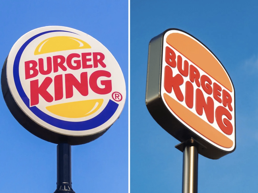
If you’re a fast food chain, how do you give off the impression you sell better burgers than Burger King? Your logo jumping out will go a long way to doing that.

Image Source: Business Insider
7. Will it stand the test of time?
Of course, it’s difficult to know what will stand the test of time. Musicians make an album with the aim of it to be a positive influence on fans for generations. Many find themselves in bargain bins a few months later.
This applies to logos, too. They can look dated very quickly, particularly if you produce something that is very much just a fad of today.
Analyze the logos that have been around for decades. How have they stood the test of time? Usually they’re clean, crisp, simple and capture the brand and its ethos perfectly.
8. Will your logo identify your brand immediately?
A brand logo is used as the quick route to your brand name, what you do as a business and what you stand for. Moreover, 59% of consumers prefer to purchase a product or service from brands with logos they can easily identify.
Being unique and standing out from the crowd will certainly help with that, but there are also a number of other ways to make it instantly recognizable.
Tying in your logo to a name can be done in a number of ways. You can use initials or acronyms, just as the Golden Arches do, or a visualization such as Fairy Liquid.

Image Source: Reader’s Digest
9. Do your market research
Less of a question more a mandate that you put plans in place to ask your potential customers questions.
Study what they think of your brand logo, whether they would notice it among a busy marketplace and what information it tells them.
You’ll get a much clearer idea of how successful your logo and brand will be through this process than you ever would just passing it around a boardroom.
Leveraging AI as a Logo Design Technique
AI is no less than a revolution, bringing with it a wave of innovation and precision. This technology is transforming how we approach logo design, making it more accessible, efficient, and tailored than ever before.
By embracing these logo design techniques powered by AI, brands can create logos that are not only visually impressive, but also deeply connected to their identity and values.
1. Understanding Your Brand’s Essence
Before you dive into the creative process, AI can play a crucial role in understanding your brand’s core values and personality.
By analyzing trends, competitor logos, and your brand’s unique characteristics, AI tools can suggest design elements that resonate with your brand’s identity. This ensures that your logo isn’t just aesthetically pleasing, but also aligns seamlessly with what your brand stands for.
2. Infinite Creative Possibilities
One of the most striking benefits of AI in logo design is the sheer scope of creativity. AI algorithms can generate a multitude of design options based on specified parameters, like:
- Color schemes
- Typography
- Imagery
This not only saves time, but also offers a broader range of choices than what might be initially envisioned, providing a rich ground for inspiration.
3. Customization and Personalization
About 90% of leading marketers say personalization significantly contributes to business profitability. So why not start with your logo?

Image Source: Ninetailed
Every brand is unique, and its logo should reflect that uniqueness. AI excels in customizing designs to the minutest detail. Whether it’s tweaking a shade of color or adjusting the font style, AI tools allow for a level of personalization that can make your logo truly stand out.
4. Efficiency and Speed
In the fast-paced business world, time is a precious commodity. AI significantly cuts down the time required to design a logo. What might take days for a human designer, AI can accomplish in hours, without compromising on quality. This efficiency is invaluable for businesses looking to launch or rebrand quickly.
5. Cost-Effectiveness
AI-driven logo design isn’t just about speed and creativity. It’s also incredibly cost-effective. Small businesses and startups, in particular, can benefit from high-quality logo designs at a fraction of the cost of traditional design processes.
6. Iterative Learning
AI learns and evolves. As it designs more logos, it gathers data, learning what works and what doesn’t. This means that over time, AI tools become more adept at creating logos that are not only visually compelling but also deeply resonant with target audiences.
7. Collaboration with Human Creativity
The magic really happens when AI is used in tandem with human creativity. While AI provides a strong foundation and myriad options, the human touch in finalizing the design ensures that the logo is not just a product of algorithms, but also of human emotion and intuition.
Seal Your Brand’s Legacy Today with MIG
Using AI in logo design techniques is a smart way to make a brand logo that really shows what your brand is all about. This modern method blends creativity, easy customization, speed, and cost savings. It ensures your logo is not just unique, but also a true reflection of your brand.
Ready to master the balance between AI vs. human content? Check out our SEO Blog Writing Service or schedule a quick consultation to learn more about how Marketing Insider Group can help you earn more leads for your business.


