Story-Driven Data Visualization: The Complete Guide
For many people, data can be deathly boring, comoplex and dry. And for marketers, particularly those in the B2B space, this is one of the toughest challenges they face when producing content every day.
Customers and prospects want to see hard data that proves why your product or service is superior and will help them achieve their business goals. But they also want to consume this content in a way that is interesting and easy to understand, and not be hit with long pages, slides or spreadsheets of numbers and stats.
So how do you communicate data effectively without putting people to sleep? It’s about telling a story and using your data to illuminate your key messaging. Data-driven storytelling has the incredible power to connect and engage your target audience, while conveying the data they want and need and moving them to take the desired action.
And according to Matt Wellschlager, VP of Marketing at Ceros, this is actually pretty easy to do. Here are the five steps you need to get started with creating story-driven data visualization:
1. Review Data Set
Before you can create any visualizations, you’ll need to look at your raw information first and explore the direction you can take with your story.
Wellschlager recommends asking and answering the questions below when reviewing your data, to help you get a better sense of the “plot points” to convey in your story:
- Is there anything I find surprising about my data?
- Does my data point to any trends or themes?
- Are there any key characters or players in my data?
2. Develop Your Story
Now that you’ve identified from your raw data the interesting plot points and direction you can take with them, it’s time to develop your story.
Oftentimes, this involves tying your plot points and the characters or players you’ve identified in Step 1 with a story arc. Alternatively, you can also come up with a creative story that narrates your plot points, in a way that resonates and appeals to your target audience.
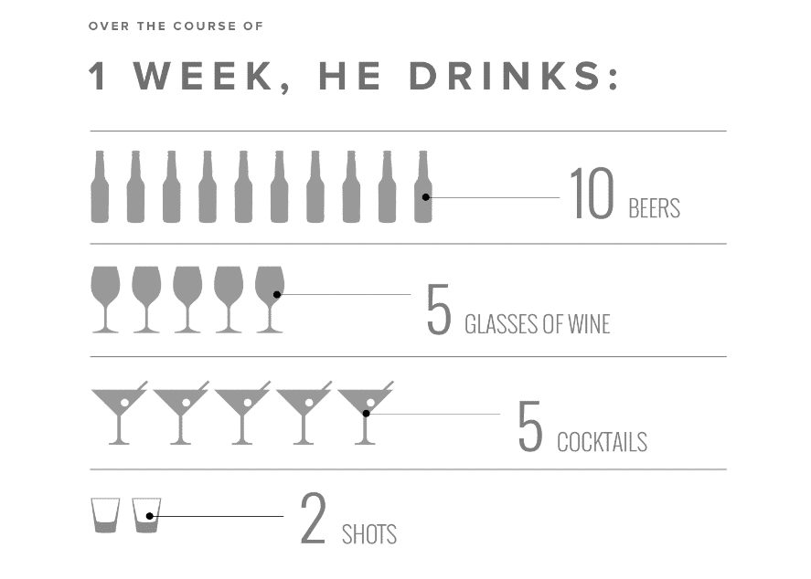
Wellschlager shared this interactive infographic as an example of a story-driven data visualization that tells the story of a young marketer attending his first marketing conference, and the number of drinks he has consumed over the course of the week.
3. Build Your Narrative Framework
Once you have your plot points and story, the next step is to develop a narrative framework. This process can vary depending on the format you choose to communicate your story, but here’s a general approach you can use as a starting point:
- Outline your key sections
- Craft copy for each section to frame your data and develop your story
- Determine the most important data points you want to highlight
- Develop the introductory copy that sets the stage for your story
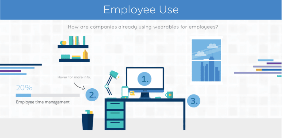
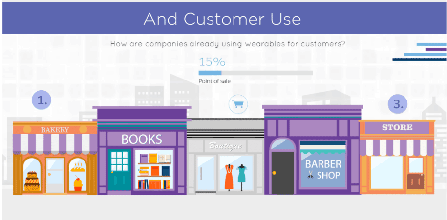
As you work through your narrative framework, you’ll need to decide which data points and information will go on your visual, including your base and secondary layer of content, if you have any. Secondary layer of content requires viewers to either click or hover over certain visuals to see additional information.
For Wellschlager, this Salesforce infographic is a great example of telling a clear story with a secondary layer of content that conveys additional stats.
4. Select the Data Visualization Format
Data visualizations are more than pretty pictures, although a nice graph or chart makes the data more appealing. Data visualizations should support decision-making by drawing attention to relationships among data and relationships between your data and influential factors that may not be captured in your data.
Depending on the data you want to present, you’ll want to choose the visualization formats that can best communicate and illustrate your story. Here are four of the most common data relationship types you can consider to convey your data:
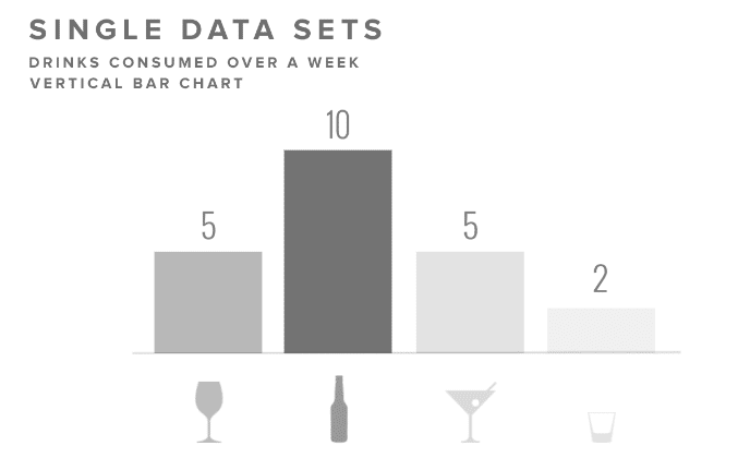
- Nominal comparison compares sets of data in no particular order. Going back to the young marketer example, here’s what the nominal comparison format can look like:
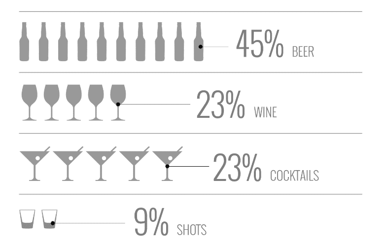
- Part-to-whole looks at how individual data points relate to each other as part of the whole data set. Using the young marketer example again, one could represent the drinks he has consumed as a percentage of his total drink consumption throughout the week, with a part-to-whole format like the below:
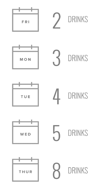
- Ranking organizes and orders your data points using a specific measurement. With the young marketer example, one way to visualize his drink consumption is by arranging this in ascending order like the example below:
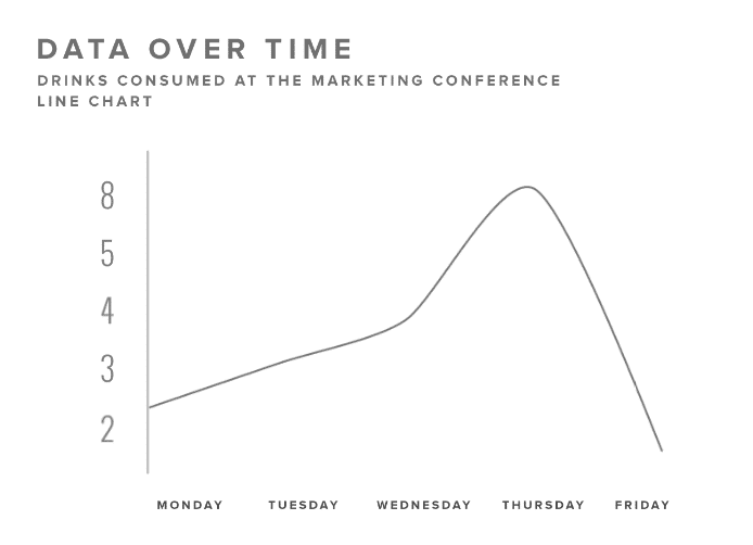
- Time series, as the name suggests, categorizes data points by time. Using the young marketer example again, one way to illustrate his drink consumption is by using a line chart to show the number of drinks he has consumed over time like the below:
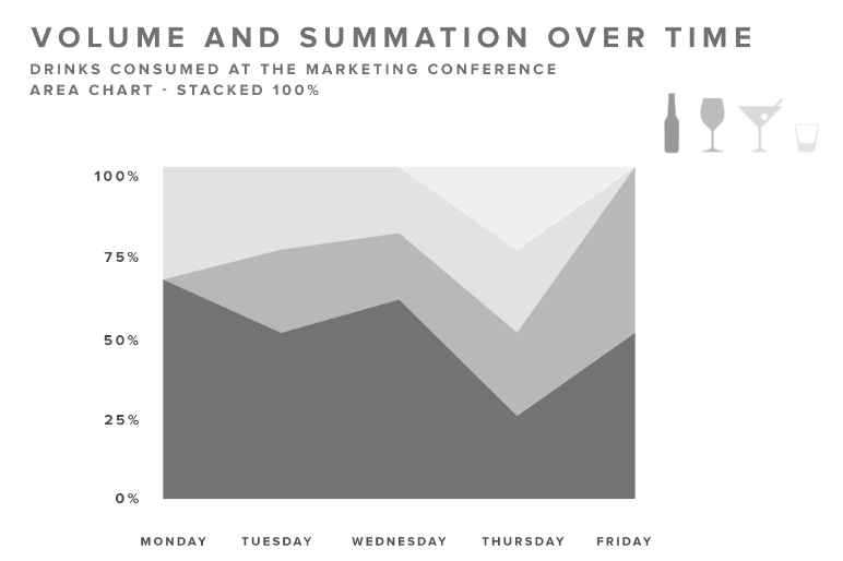
Another way to visualize this is by organizing the data by volume and summation over time with a stacked bar chart:
You’ll need to first identify the type of relationship your data points deal with, and this will help you determine the most effective data visualization formats you can use to convey your story. These can range everything from bar charts to line charts, pie charts, stacked bar charts and area charts. Different types of data call for different data visualizations.
- Percentage data is often clearest when represented by a pie chart.
- Trend data is often best displayed using a line graph or bar graph.
- Comparing things against other things is often best done with a histogram.
- When you want to display trends across a number of things, stacked histograms likely do the job for you.
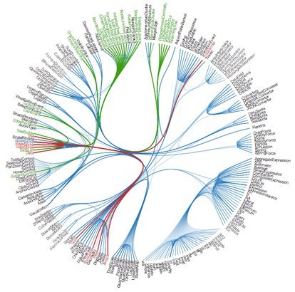
- Complex data is often easiest to evaluate when you have a heat map or an association tree.
By the same token, having the wrong data visualizations can make it impossible to derive insights that aid decision-making. Take a look at this hot mess
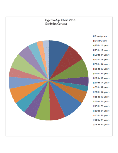
There are just too many colors and the slices of pie don’t really help you understand the data. If, instead of using a pie chart, you clean this up with fewer colors and histograms representing the size of the populations, you get a much clearer picture of what the demographics look like relative to each other, which aids decision-making.
5. Create Your Visual
Now that you have developed your content and data points, narrative framework and visualization formats, it’s time to actually create the visual! You’ll want to work closely with your designers to make sure that, from creative concept to execution, you can tell your story in an engaging and interesting way.
Here’s a great data visualization example from Red Bull that compares the speed of Red Bull Air Race planes with other motorsport series.

Is story-driven data visualization a part of your content marketing strategy? If you have any other tips and best practices for creating effective data visualizations, please share them with me on LinkedIn or Twitter.


Get a Free Consultation
for Content Marketing