
The Psychology of Color in Marketing and Branding
Imagine you order a hot chocolate at the local coffee shop and get it into a white cup. We bet you don’t know what will happen next. But we do know. Most likely, you won’t enjoy the drink – and not because the bad service, high price or poor taste but rather due to an inappropriate color of the cup.
Perhaps you do not even think about it, but our perception greatly depends on the color. Every day we subconsciously react to colors surrounding us. Imagine that you go to the website decorated orange and pink. Not the best trip, right?
In fact, customers make decisions in a few seconds. And you have these few seconds to affects their reaction and behavior.
How to Skillfully Manage the Color Gamut of Your Brand
The use of color for brand building is far from a perfect science. After all, every group, let alone every individual, doesn’t perceive periwinkle in the same exact way. Still, research has demonstrated that the way colors are used by brands does impact the perception of a product or service – as much as 90 percent of off-the-cuff judgements about a brand are based on color.
Whether the impact of color is rooted in Jung’s collective unconscious and tens of thousands of years of exposure to color associations, or it is just our cultural conditioning, color is always worth considering in marketing. Even knowing nothing about the business reputation of your company, potential customers get the idea about your brand when seeing its logo, ads, or any other representational sign.
Moreover, the first impression defines whether the potential buyer will be interested in further cooperation. Perhaps unwittingly, clients may subconsciously decide whether they should do business with you, buy a product, or order the services. Our clients and designers always try to find a balance in coloring. You can see how they combine colors in www.designcontest.uk/logo-design
Color, or rather a combination of several colors, increases brand recognition by, at least, 75%.
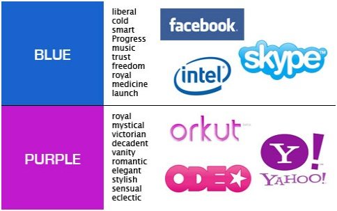
Purple Brands
Purple is associated with the things we connect with royalty – luxury, the finer things in life, assumed power – making it a popular choice in the luxury and beauty industries. It’s also connected with both spirituality and imagination, which is where you’ll also see a lot of brands in the creative industries turning to purple to tell their story.
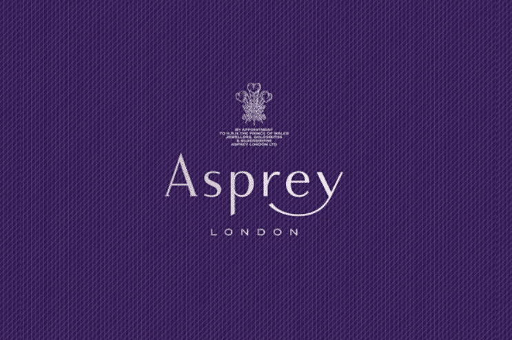
Asprey is the quintessential purple brand. The company has been selling luxury items, customized jewelery, and high-end accessories since the 18th century. They even have a line of luxury personal care products called ‘Purple Water,’ so consumers can immerse themselves in the brand’s purpleness:
“Purple water is the distillation of the rich and creative past of Asprey and its exciting and luxurious present.”
And so why is Yahoo purple? The brand’s electric plum shade doesn’t exactly suit the more egalitarian concept behind the web services provider. Yahoo’s color choice was actually the result of chance. The story goes that one of the company’s founders went out to buy gray point to color the office walls. When it dried, it turned out to be lavender. Unlike most purple brands, Yahoo is one that fell into its purpledom.
Blue Brands
Blue is wholesome, small-town dependable, and trustworthy. A lot of financial industry companies use blue (Allstate, JP Morgan, Progressive, American Express), a color also associated with financial stability.

German-based international skin care brand Nivea has gone so far as to trademark their specific shade of navy blue, making it one of the few protected color marks in the world. A company known for its simple, clean products, the unobtrusive blue hints at the ‘snow white’ product inside. (Nivea is rooted in the Latin word, niveus, which means ‘snow white’).
Facebook’s use of blue makes sense. What could be more appropriate for a brand that has connected the whole world into one massive small-town? The use of color fits well with the sincere, and very solid image the social media network projects. Yet, like Yahoo, the blue branding wasn’t as thought out as it appears. In an interview with The New Yorker, Facebook founder Mark Zuckerberg explained that blue is the color he can see the best. He’s red-green color blind.
Red Brands
Red is pure, raw energy. It’s the most inspiring of colors – passionate, exciting and stimulating. This is the attention-getter of the color wheel.
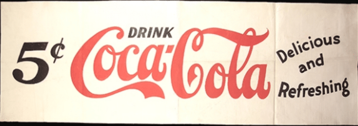
Coca Cola has been using red since the 1890s. The brand’s particular shade of bright, bold cherry red contrasted with white has become iconic. It also perfectly reflects the confidence and zest for life that this brand uses in its marketing, even 120 years later.
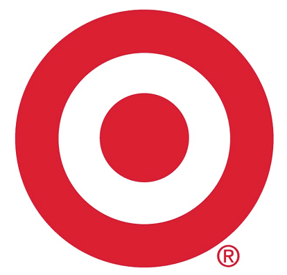
Target is another brand that is known for its bright red branding. Their logo started out as the red bull’s eye with the brand name in the center of the target. As people became to associate the symbol with the store, they no longer needed to use the text. What’s interesting about Target’s marketing is they keep the ‘red’ tempo, staying true to the upbeat, lust-for-life persona throughout their campaigns.
Yellow Brands
Yellow is a fun, warming, optimistic color. This cheerful color is great for those brands that can live up to the sunny disposition, like Ikea, Subway and Snapchat.

The yellow Best Buy logo has served this electronics retailer well. The company introduced the current version in 1992. Simple block font black lettering over a yellow price tag says so much about the brand’s values – good customer service and a fun showroom. The color helps to create the association of a positive shopping experience, and it works. Best Buy is a household name.

Amazon is another customer service oriented brand that uses yellow in the logo to get the positive, welcoming message across. The Amazon logo uses a yellow arrow to move from the letter a to z, hinting at their, ‘we sell everything’ persona. And the smile shape made by the yellow arrow even further demonstrates the happy image this company is going for. Amazon is a very yellow brand.
Other Colors
- Orange (fun, action, excitement, passion, and warmth). Amazon, Fanta, Nickelodeon, and Firefox are the great businesses that quickly catch the user’s eye with orange color.
- Green (wealth and nature). Financial services always use green since it is associated with dollars: Fidelity and TD Ameritrade accept green as the main color of their logos. As for Greenpeace, Animal Planet, and Whole Foods – these companies bet in the “naturalness” of green.
- Pink – a romantic and feminine color, associated with love and warmth. Victoria’s Secret, Barbie, and Baskin Robbins are three the most known brands which bet on pink color.
Use Contrast, but Don’t Overdo It
Homepage and selling page are most frequently visited; therefore, it’s reasonable to motivate clients to action by the visual effects in the design.
Use color to evoke sympathy and help visitors to build a trusting relationship with your website and company. People make conclusions about the surrounding world and products on a subconscious level within 90 seconds. Moreover, for almost 90% this estimation is based on the color only.
According to studies, about 85% of buyers called attractive color as the main reason that pushed them to the decision to purchase the product.
Thus, contrast color gamut is more effective comparing to monophonic design. Red will not necessarily be better than green. It is possible that some other contrasting color will surpass the red.
Thoroughly test possible options and you’ll find the most “selling” combination.
Color Psychology in Advertising, Sales and Landing Page Optimization
A color causes an emotional response that associates users and potential customers to the brand. Wisely chosen color combinations attract visitor’s attention and help him to faster and for a longer time remember the brand.
The same applies to advertising. If the images and color combinations are chosen correctly, then the advertising becomes attractive. And it is not necessary to use “flashy” shades. The main thing is to convey the message. Our reaction to color is 80% unconscious. Therefore, simply choose the appropriate colors and be sure that the consumer will understand and accept the marketing message.
To test the influence of color on your landing page, just check the different color combinations to find the most profitable one. For example, you can test the effectiveness of the CTA button by changing its color. According to studies conducted by software manufacturers, a red CTA button makes 21% more transitions that a green one (it is worth considering that green was the predominant color on the page.)
For external sites and ad campaigns on third-party platforms, consider using colors which are outside the main color palette of your brand and corporate colors. The color scheme of your ads should be well coordinated with the webpage where these ads are placed. Otherwise, you risk reducing the effectiveness of your ads.

The website where your ads will be placed most likely will be different from you landing page. Therefore, the ads may compete with many other page elements that you can’t control. In this case, be sure to keep in touch directly with the publisher and choose the color combinations that will work efficiently.
Therefore, try not to repeat after the majority of websites: avoid using a lot of white in your ad or banner. Otherwise, your ads may simply merge with the main background of the page, or be falsely perceived by users as part of the adjacent ads.
The Marketer’s Key to the Color Wheel

There are no doubts that the best approach is to consider your brand as a person, determining its strengths and core values. This will allow you to choose colors to convey correctly all of the brand’s attributes. You will achieve much more success in marketing if the color palette correctly positions your brand from the very first seconds.
The key is to use color to support your already existing brand personality, rather than dictating your brand persona based on the color association you want to choose. Using bright yellows all over your branding isn’t going to magically make people feel optimistic about your business, especially if you are marketing for insurance. You can’t dress a candy company in green and convince consumers your sugary treats are good for them, nor will choosing lipstick red for your logo inspire passion around your efficient, but appropriately unsexy accounting software.
The brands that use the psychological impact of color to their advantage are those that choose the right colors to further communicate who they already are. Dell computers are dependable. Lowe’s is for consumers who value self-reliance. Blue works. Cadbury chocolate is known for being luxurious. Crown Royal Canadian Whiskey was created as a gift for royalty. Purple works.
Know your brand story and you can come up with the perfect color to tell it with.
Over to You
Subconsciously influencing the choice of the buyer, colors help to improve the company’s reputation. It is possible that rethinking and experimenting with the colors used in the marketing of your company will increase not only the number of clicks on the website but also the appeal of the brand as a whole. The key is to create an unobtrusive but harmonious bright image that will clearly show the advantages of your products or services.
One thought on “The Psychology of Color in Marketing and Branding”


Get a Free Consultation
for Content Marketing

I enjoyed the article by Brain Jens on how color effects a person’s perception of a brand. It was great to see you mention perception early on in the article. When I conduct branding workshops for start ups, I hold up a robin’s egg blue box and a tan color box and ask a student to choose one. Most go for the robin’s egg blue because of it’s association with Tiffany’s.
They don’t know what’s inside the box, but the color associated with the Tiffany blue has created a perception of the quality of what’s inside the box.
That was also a great visual of brands and their corresponding colors.